This was a long overdue project. Like, longgg overdue. After months of feeling like my goals for this blog didn’t match the effort I’d put into its branding, I knew I needed to take some time and narrow down the visual identity of The Blogging Brew. Of course, my college budget doesn’t allow much room for anything other than food and the occasional Target splurge, so this was another DIY project for me! I’ve never designed a brand before, but I have to say, I’m pretty proud of this outcome.
I went back and forth on a lot of decisions, but there were a few aspects I knew my brand needed to convey:
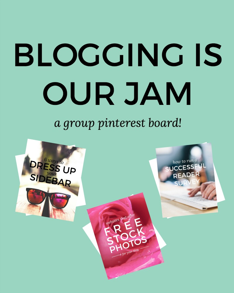
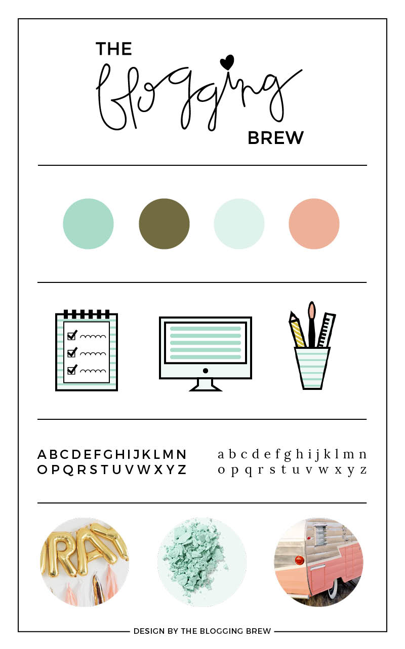
- Hand-lettering is such a fun way to explore different mediums and styles, so that was a definite must-have. While brush-lettering was a close second, I wanted something a bit smoother to match the simple and clean style of my blog. My logo is the obvious example of this, but I’m slowly finding more ways to incorporate that lettering into my graphics, as you can see in the sidebar!
- I can attribute this next aspect to Jamie at Spruce Rd.: icons! After watching the video from her first Lunch + Learn on creating icons in Illustrator, I fell in love with the process and knew this type of design would be the perfect addition to my blog.
- After realizing that one main color wasn’t doing it for me, I knew expanding my color palette was another must. The colors above will be featured the most, but I’ll be posting later about my extended palette, which includes a few secondary colors as well as an oh-so-helpful neutral palette.
Now that the semester is over and summer has officially begun, I’m excited to have more time to devote to this blog, as well as some other projects that I’ll be debuting later this summer! And speaking of that, I have another surprise set to launch at the beginning of June, and I cannot wait to show you guys! That’s all I’m saying for now, but be ready.