The post How To Customize The MailChimp Signup Form On Your Blog appeared first on The Blogging Brew.
]]>Update: As you can tell, I don’t have any subscription boxes on my website anymore as I have some big plans for this blog happening in June 2016 that require stopping subscriptions for now! This post will still teach you all you need to know though, and thanks for understanding!
Everyone that has an email list wants one thing—more subscribers!  You can promote it on social media, email your long-time followers, or write a rockin’ post about it, but one of the most effective and permanent ways to promote your email list is by installing a signup form on your blog. This form will allow any of your readers to fill out their information and subscribe in seconds, and can be displayed anywhere on your site.
MailChimp is my emailing service of choice (I’ll tell you why!), so this tutorial will be based on their forms specifically. If you’re using a different emailing service, you can still follow along and get the general idea of how the code works!
So First Off, Why MailChimp?
- It’s extremely easy to set up (it took me less than 30 minutes to sign up, create my forms, and start promoting my list!), so it’s a great option for newbie bloggers.
- MailChimp is totally FREE for up to 2,000 subscribers, and by the time you get to that number, you’re probably earning enough that the fee seems like nothing to you!
- Designing your newsletters is super simple with their drag and drop interface. No coding required!
Choosing The Location For Your Form
I’ve looked around my favorite blogs for some inspiration here and came up with 3 main locations for your signup form:
Above Your Content/Sidebar
If you just launched your newsletter or are offering a new content upgrade, this location will definitely catch your reader’s eyes! Be cautious about how you design a form here though, because it’s the most in-your-face of these options and you don’t want to distract your readers from the rest of your blog.
Within Your Sidebar
The least invasive of these options, your sidebar is like free advertising space for your own blog, and is a great location for a mini form! Depending on the width of your sidebar, you may even want to for-go the form altogether and just create a button that links to your form. I created a custom graphic for mine, and added a longer description about what’s included in my newsletter for those wondering!
Below Your Blog Posts
As long as your readers are finishing your posts (hopefully they are!), they’ll all pass by this location on the way to the comments. Much less invasive than the previous option, yet still obvious, this is my favorite location for a signup form. I added an extra line of info to mine so my readers know exactly what they’re getting when they sign up, and chose a vibrant color so it stands out against the comments and share buttons.
Creating Your Custom Signup Form
Step 1: Get your signup form code
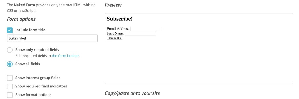
Open up MailChimp and head to Lists > Your Newsletter > Signup Forms > Embedded Forms and select the Naked form. This is the best option for customizing your form because you’re only given the HTML (there’s no CSS styling). I unchecked most of the options, but made sure that all the input fields I want are included!
Step 2: Place the code in a text widget, and make the following changes
Add a text (called HTML/JavaScript on Blogger) widget in whichever location you chose (you may have to create a new widget area for this, so if you don’t know how to do that, you might want to stick with a widget area that already exists!). Then, make these changes to the code:
Remove the labels
Get rid of any line that looks like this:
<label for="mce_EMAIL">Email Address</label>
This will remove the words above each of the input boxes. Don’t worry, we’ll add them in a different location next!
Edit the inputs
Everywhere you see input tags, add placeholder=”TITLE OF WHAT’S BEING INPUT”. They’ll look like this:
<input type="email" value="" name="EMAIL" class="required email" id="mce-EMAIL" placeholder="Email Address">
Add some CSS styling to your form
Your form probably looks pretty boring right now. To get things looking fancier, we’ll add some CSS styling to it. Copy and paste this code into your CSS file (for WP users, go to Appearance > Editor):
/* Changes the style of the overall form */
#mc_embed_signup {
    background: #f8f8f8;
    color: #000000;
    padding: 20px;
        text-align: center;
}

/* Styles the header text above the inputs */
#mc_embed_signup h2 {
    font-size: 18px;
    margin: 0 0 20px;
    color: #000000;
    text-align: center;
}

/* Adds extra space around the input boxes */
#mc_embed_signup .mc-field-group {
    padding: 10px 0;
}

/* Styles the input boxes */
#mc_embed_signup  input {
    width: 200px;
}

/* Styles the subscribe button */
#mc_embed_signup .button {
    background-color: #000000;
    color: #ffffff;
    margin: 0 auto;
}
After styling your form, it should look something like the example below. Yours might not look exactly like this because I do have some extra styling within my blog’s code that affects this! If some of your styles aren’t showing up, try adding !important after the specific line that’s affected, but before the semicolon. This could mean you have other styles within your code that’s taking priority over the new code.
It can be kind of difficult to get the exact style you’re going for, but mess around with the code a bit and see what you can create!
If you followed this tutorial and built your own custom MailChimp signup form, link to your blog in the comments!
The post How To Customize The MailChimp Signup Form On Your Blog appeared first on The Blogging Brew.
]]>The post How To Make A Drop Down Navigation Menu On Blogger appeared first on The Blogging Brew.
]]>Maintaining a clean, easy to use navigation menu is a huge part of creating an effective design. Too many links can confuse a reader, while too few can leave them wondering what they’re missing. A drop down menu is a great way to hide extra links while still making them available to curious readers.
While WordPress makes it easy to add a drop down menu (yay sub items!),it’s a little more complicated on Blogger. We’ll basically be creating a list within a list, and all that’s needed is some extra code and styling!
Place this code in an HTML/JavaScript widget placed in the navigation area.
<!--Start Navigation -->
<div id="navigationbar">
<ul id='navigationcss'>
<li><a href="LINK1">Home</a></li>
<li><a href="LINK2">Category</a>
<ul>
<li><a href='LINK3'>SUB-CATEGORY-1</a></li>
<li><a href='LINK4'>SUB-CATEGORY-2</a></li>
</ul>
</li>
<li><a href="">Category</a></li>
</ul>
</div>
<!--End Navigation -->
Use this code to add another link:
<li><a href="LINK2">Category</a></li>
And this code to add another link with drop down categories:
<li><a href="LINK2">Category</a>
<ul>
<li><a href='LINK3'>SUB-CATEGORY-1</a></li>
<li><a href='LINK4'>SUB-CATEGORY-2</a></li>
</ul>
</li>
Fill in your information, save the widget, and head over to Template > Edit HTML (backup your template before editing any code as always!).
Now we’re going to add the styling that makes your menu look beautiful! First, open up the CSS section within
<b:skin> ... </b:skin>Look for the Tabs section, which should look something like this:
/* Styles the first link in your menu */
.tabs-inner .section:first-child ul {
margin-top: -1px;
border: none;
}

/* Styles the overall navigation bar */
.tabs-inner .widget ul {
background: #000000;
border: none;
text-align: center;
}
/* Styles the individual links */
.tabs-inner .widget li a {
font: 12px Arvo;
border: none;
color: #ffffff;
}
/* Styles the links when hovered over */
.tabs-inner .widget li.selected a, .tabs-inner .widget li a:hover {
color: #333333;
background-color: #ffffff;
text-decoration: none;
}
You can either edit your current tabs section to your liking, or place the above one below your current one and use the comments provided to guide yourself. Play around with the values until you get the look you want!
Below that, paste the following code:
#navigationbar {
width: 100%; /* change the width of the navigation bar */
height: 35px; /* change the height of the navigation bar */
}

#navigationcss {
margin: 0 auto;
padding: 0;
}

#navigationcss ul {
float: none;
list-style: none;
margin: 0;
padding: 0;
overflow: visible;
}

#navigationcss li a, #navigationcss li a:link, #navigationcss li a:visited {
color: #ffffff; /* change color of the main links */
display: block;
margin: 0;
padding: 10px 30px;  /* change the first number for the top/bottom spacing, and the second number for left/right spacing */
}

#navigationcss li a:hover, #navigationcss li a:active {
color: #FF69B4 ; /* change the color of the links when hovered over */
margin: 0;
padding: 10px 30px; /* make sure these are the same as the section above! */
}

#navigationcss li li a, #navigationcss li li a:link, #navigationcss li li a:visited {
background: #ffffff;  /* change the background color of the drop down box */
width: 150px;
color: #000000; /* change the color of the drop down links */
float: none;
margin: 0;
padding: 7px 10px; /* similar to above, change for the spacing around the links */
}

#navigationcss li li a:hover, #navigationcss li li a:active {
background: #FF69B4 ; /* change the background color of drop down items on hover */
color: #ffffff; /* change the color of drop down links on hover */
padding: 7px 10px;  /* keep these the same as the above section */
}

#navigationcss li {
float: none;
display: inline-block;
list-style: none;
margin: 0;
padding: 0;
}

#navigationcss li ul {
z-index: 9999;
position: absolute;
left: -999em;
height: auto;
width: 150px;
margin: 0;
padding: 0;
}

#navigationcss li:hover ul, #navigationcss li li:hover ul, #navigationcss li li li:hover ul, #navigationcss li.sfhover ul, #navigationcss li li.sfhover ul, #navigationcss li li li.sfhover ul {
left: auto;
}
Use the comments to understand what each line does, and edit it until you have the style you want. Because templates can come from many sources, there’s a chance you could have issues with using this code on your blog if your current code has been altered a lot!
Was this tutorial helpful for you? Consider endorsing me on my Activate by Bloglovin’ profile! It helps me understand what I do best, and what types of posts y’all find the most helpful!
The post How To Make A Drop Down Navigation Menu On Blogger appeared first on The Blogging Brew.
]]>The post How To Design An Effective Blog Footer appeared first on The Blogging Brew.
]]>I wrote about six ways to dress up your sidebar a few months ago, and I received a lot of comments from bloggers who were either thinking about or in the process of redesigning their sidebars. It sounded like everyone was excited to tackle that project, and I loved hearing how inspired they were! So to continue on the blog inspiration trend, I want to talk about another neglected space of most blogs—the footer.
Unlike the sidebar, the footer is hidden for most of the time a reader spends on your blog. The only way they’ll usually see it is if they’re curious about your blog and want to scroll through your home page, or if they decide to comment on a post they enjoy. It can seem redundant to spend time designing a part of your blog that doesn’t get nearly as many eyes as your content, but the eyes that do see it are most likely ones that are interested in your blog and want to learn more!
Similar to the sidebar, your footer takes up a good chunk of space on your blog, and has the ability to take up more than you might think. My footer is a little over 200 pixels in height, and I’ve seen even bigger ones! A lot of bloggers just put an attribution there, which is perfect if you’re looking for something simple and don’t want it to draw attention, but if you want to make your footer even more effective, there are tons of things you can add and style to your liking! Here are some examples:
- Email subscription opt-in
- Category buttons
- A logo element
- Your contact info
- Social media icons
- Navigation links
- Instagram/Pinterest widget
- Mini bio
- Popular posts list
What’s best for my blog?
Depending on your blog’s content and your content marketing plan, some footer elements may benefit you more than others. For example, if you offer a mailing subscription for your readers, I would definitely recommend placing an opt-in in your footer! Likewise, if you create beautiful artwork, products, or anything visual and post about it on a social network, placing a widget for that social network in your footer would be beneficial. It’s all based on your needs! That said, try to avoid putting too much in your footer. It can easily take on a cluttered look, which isn’t what you want your readers to see after they’ve finished reading your amazing content!
Styling Your Footer
For simple styling, you can generally just edit the CSS of the “footer” tag. Here’s an example on one of my demo blogs:
footer {
     display: block;
     background-color: black;
     color: white;
     border-top: 3px solid #c4a0a4;
}
This is the effect that code would produce (the link color was set elsewhere in my stylesheet):
Footer Inspiration
I’m sort of a blog design enthusiast, so I love finding inspiration from other blogs and seeing what creative ideas are out there. If you’re planning on redesigning your footer, try searching around your favorite blogs and see what they included, or how they went about designing their footer to match their blog. I’m not saying you should steal their ideas, but looking around can really help when you’re stuck on what to do! Here are some of my favorite footer designs:
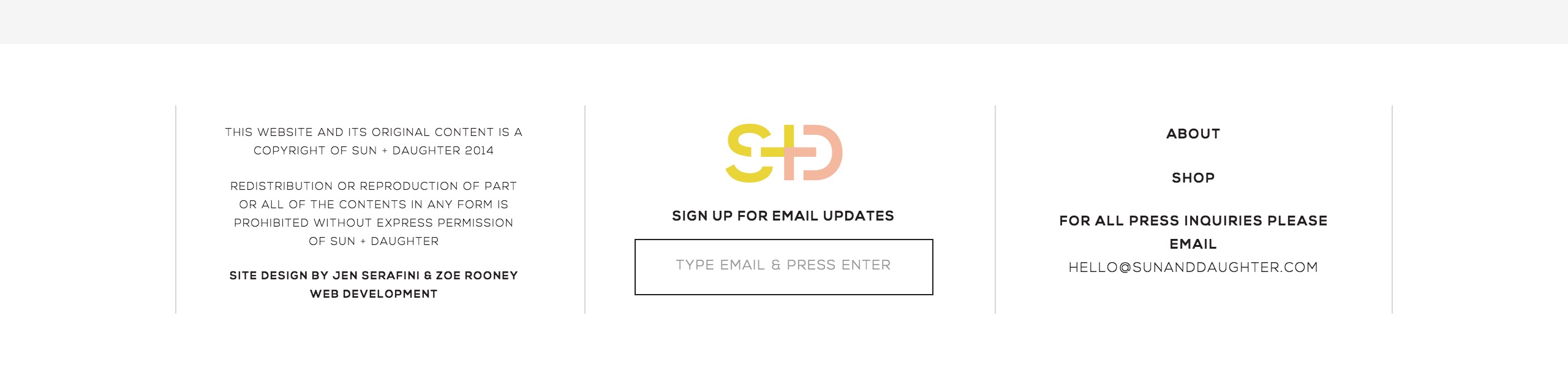
Source: Sun + Daughter
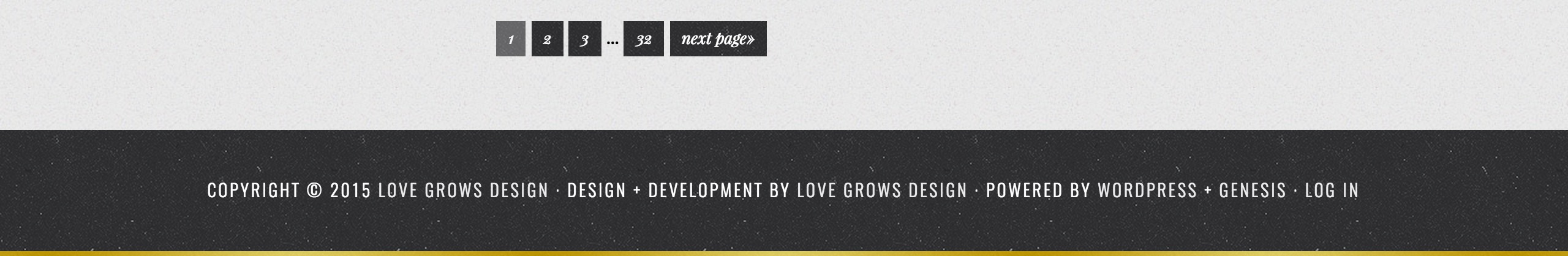
Source: Love Grows Design

Source: Meredith Noelle
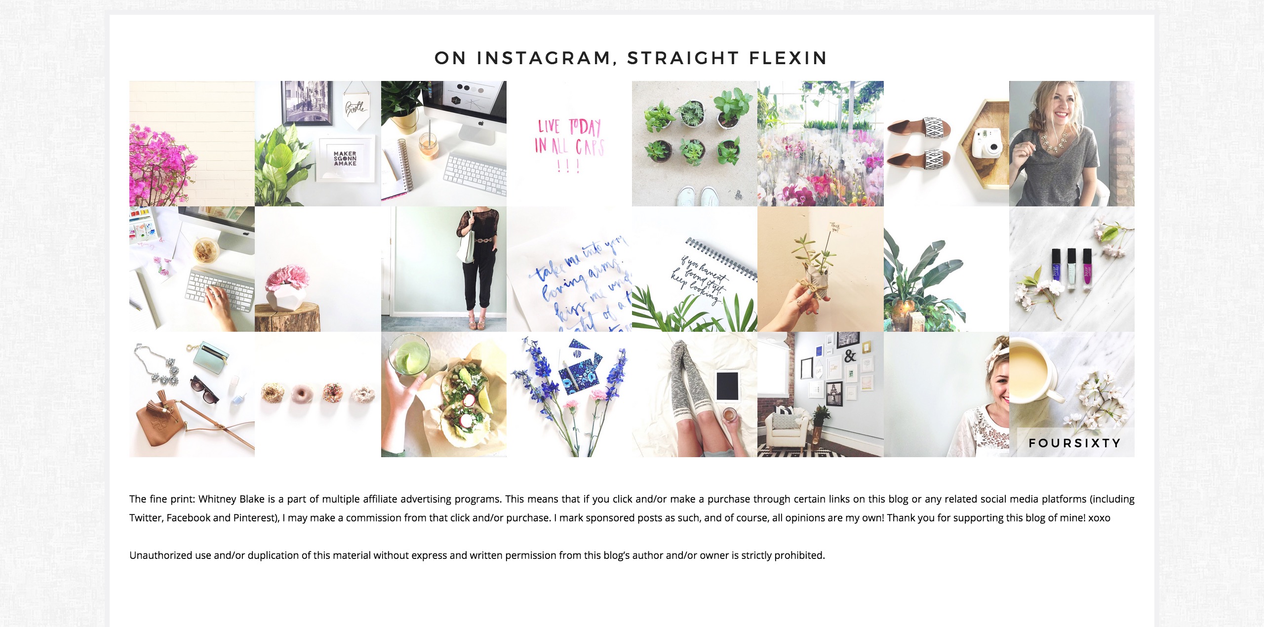
Source: Whitney Blake
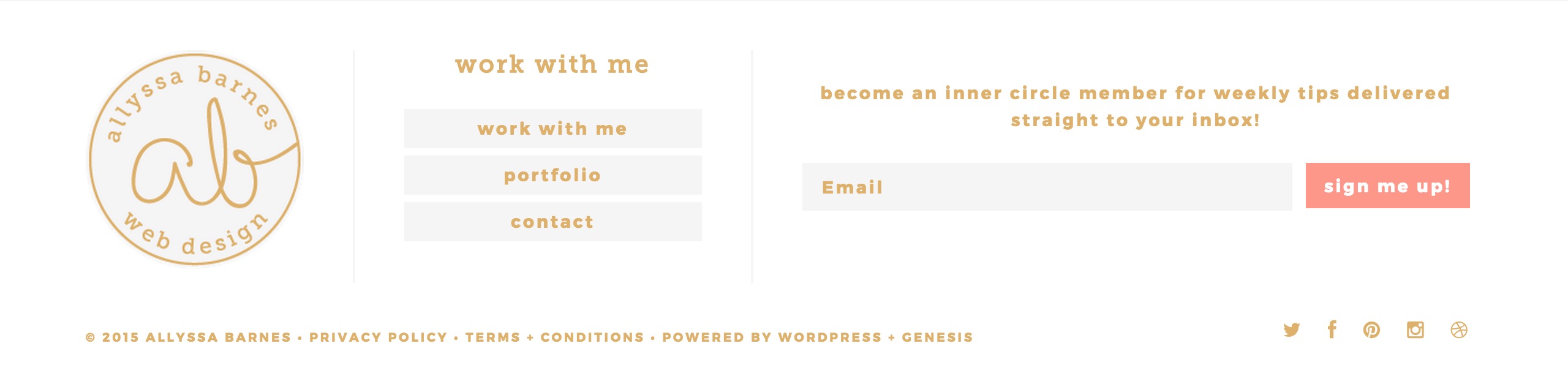
Source: Allyssa Barnes
Are you considering giving your footer a makeover? What are some things you’d consider “must-haves” for a footer?
The post How To Design An Effective Blog Footer appeared first on The Blogging Brew.
]]>The post How To Create A Hover Effect For Your Blog Images appeared first on The Blogging Brew.
]]>Note: This tutorial is currently for Blogger blogs only, but I plan on adding a WordPress version soon!
Every blogger has a common goal in mind when creating content: drawing their audience in. If you can keep your reader’s eyes on your content until they’ve read the entire post, then you’ve discovered the secret! But not a lot of blogger’s can say that confidently, including myself. I’m still learning all the tricks behind creating super fantastic content that readers just can’t resist finishing, but I’ve gathered a few tips along the way. Interestingly enough, one of those tips has nothing to do with the words on the page, and everything to do with the images you place between them.
Whenever a blogger asks me for tips on making their posts better, I always say that quality graphics are a necessity. They’re fabulous eye-catchers (I guess that’s kind of obvious), and they add a sense of professionalism to your blog. But what if I told you that those images could work even harder for you? That’s where hover effects come in.
I don’t know about you, but I just love when a blog has hover effects. Everywhere. On links, category tabs, social media buttons, and pretty much everything that’s clickable. They add a level of engagement that your content alone can’t create, and for some reason I feel more inclined to click something if it has a hover effect. Graphics are no exception, which is why today I’m going to teach you how to add a hover effect to your blog images! To keep things simple, I’ll show you how to change the opacity of an image on hover, which is the effect I have my blog images set for.
I made two different tutorials for this, with one geared towards those who have coding knowledge/want to learn about coding, and the other for my followers who want absolutely nothing to do with coding. I think I’ll try this method for the rest of my tutorial posts, because I know some people like having a simpler option.
METHOD ONE: NON-CODERS
1. From your blog’s Blogger page, go to Template > Customize > Advanced > Add CSS
2. Paste the following code:
3. Press Apply To Blog That’s it! If you want to change the intensity of the transparency effect, just change the “.7” to a different number between 0 and 1. “0” means the image is completely transparent, and “1” means the image is completely opaque.
METHOD TWO: CODERS
1. From your blog’s Blogger page, go to Template > Edit HTML
2. Search for “.post-body img”. If you can’t find it, just add “.post-body img { }” within the “Posts” section of your CSS template. Your CSS template is the area between <b:skin> and ]]></b:skin>.
3. Between the curly brackets, type out opacity:1.0; This will make sure that when your image isn’t being hovered over, it’s completely opaque.
4. Below that section of code, paste the following:
This creates the hover effect. If you want to change the intensity of the effect, just change “.7” to a number between 0 and 1. “0” means the image is completely transparent, and “1” means the image is completely opaque.
This is what the final code should look like:
That’s it! I love pairing this effect with a Pinterest button, because it highlights the button so well. Check out my other tutorial if you’re interested in making one!
If you’re nifty with coding, you can take this basic tutorial and make it your own with a few edits. Maybe add a border, or a text overlay! Take a few seconds to roam around my blog and you’ll notice I’ve hidden hover effects just about everywhere. One of my favorites is the hover drop down menu in my “categories” tab up top.
The post How To Create A Hover Effect For Your Blog Images appeared first on The Blogging Brew.
]]>The post Adding A Hovering Pinterest Button To Your Blog Images appeared first on The Blogging Brew.
]]>Note: This is currently a Blogger only tutorial, but I plan on adding a WordPress version soon!
As you probably know by now, Pinterest is one of my favorite social media platforms, especially when it comes to blogging. It’s the perfect place to get your content in front of new eyes, and test out your approach to new readers. And I mean, who doesn’t love an infinite feed of blogging tips, clothing styles, and cute puppies? Simply put, I can’t get enough of it, so when I redesigned my blog a few days ago, I made sure it was Pinterest friendly!
One of the best things you can do for your blog is make your content easily shareable. If I can’t find a way to share your post within a few seconds of glancing, I probably won’t share it. I’ve found that the easiest way to prompt my readers to pin my graphics is by making it pinnable through a hover button. That way, all they have to do is hover over their favorite image, click my custom button, and be taken to a window for pinning it! You might have seen this kind of button on other blogs and thought it was something only knowledgable coders can install, but I promise, it’s super simple.
I’m going to take you through a short tutorial for installing your own hovering Pinterest button, and a few tips for designing your custom button. If you want to make yours even more interactive, I’ll also show you how to add a hover transparency effect!
INSTALLING YOUR PINTEREST HOVER BUTTON
1. From your blog’s dashboard on Blogger, go to Template > Edit HTML.
2. Search for the </body> tag.
3. Copy the code below, and paste it above the </body> tag:
4. To use your own custom button, replace the URL in line 3 with the direct URL of your button image. You can get that URL by uploading your image to a website like Photobucket.
5. If you don’t want your button to be placed in the center of your graphic, change the center in line 4 to topleft, topright, bottomleft, or bottomright.
6. Save and view your blog!
DESIGNING YOUR CUSTOM PINTEREST BUTTON
The great thing about this tool is that you can use whatever image you want, which is great for keeping your blog’s color scheme consistent! Here are some tips for creating the best Pinterest button:
- If you don’t have professional graphic design software, I recommend using a website like Canva, Pixlr, or Picmonkey. I might have to make an entire post about these websites, because I love them so much!
- A good size to go off of is 100 x 100 pixels, which avoids covering up your graphic too much or making it too small to read.
- If you use text on your button (like “Pin It!”), use a simple font. Fancier fonts tend to take up more room, meaning the text has to be smaller to fit in your button. An exception would be using your blog header’s font, as long as it’s readable!
-
Stick to your blog’s theme. It makes your blog look more professional and clean!
ADDING A TRANSPARENCY EFFECT ON HOVER
1. From your Blogger dashboard, go to Template > Customize > Advanced > Add CSS
2. Copy the following code and paste it in the box:
3. Click “Apply to Blog” and check out your effect!
UPDATE: I will no longer be following comments on this post, so if you’re having any trouble, feel free to contact me!
The post Adding A Hovering Pinterest Button To Your Blog Images appeared first on The Blogging Brew.
]]>The post How To Make A Back To Top Button For Your Blog appeared first on The Blogging Brew.
]]>Note: This is currently a Blogger only tutorial, but I plan on making a WordPress version soon!
After getting a ton of great feedback for my last Blogger tutorial, I decided it was time for another one! I was planning on making a tutorial for adding social media icons to your navigation bar, but this week has been crazy busy for me and I haven’t found the time to put that one together. Instead, I found a super simple way to make a back to top button that I couldn’t wait to share with y’all!
I just installed this button on my blog a few days ago, and I love it! You can use any image you want, which is perfect for anyone who wants to make sure this button matches their design! I also love how it fades in and out; it’s the little things that get me! Oh, and it doesn’t involve your template code whatsoever, so there’s no need to worry about messing your design up if you’re clueless about coding. As long as you know some basics about Blogger, you’ll be good to go!
Design Your Button
I made my button using PicMonkey, but you can use whatever photo editing method you want! This website is my favorite for editing/creating graphics because it’s free and has just about everything someone with my skill level could need! Maybe someday I’ll make it to the Photoshop level, but right now I’ll settle with pre-made graphics.
For my button, I just took one of the pre-made arrow graphics and added some text below it. You can get as fancy as you want, or keep it simple like I did!
Once you’ve designed your button, head over to a website like Photobucket and grab the URL for your image. You’ll need this when you’re inputting your code!
Create Your Widget
Go into the Layout section of Blogger and create a new HTML/JavaScript widget in the footer area of your blog. This is where all of your code will be going!
Add The Code
This is where the magic comes in! After searching for what seemed like forever to find the perfect code, I found this at My Blogger Tricks. They have a bunch of other great tutorials, but this is one of their updated versions with all the extra smooth scrolling and fading effects. Paste this code into the widget you just made, and add the URL for the image you created where it says “IMAGE LINK”.
Save your widget and you’re done! Go check out your blog to see your new button and test it out!
UPDATE: I will no longer be following comments on this post, so if you’re having any trouble, feel free to contact me!
The post How To Make A Back To Top Button For Your Blog appeared first on The Blogging Brew.
]]>The post How To Make A Sticky Navigation Bar On Blogger appeared first on The Blogging Brew.
]]>It’s been a week now since I finished my blog’s redesign, and I’ve had some amazing feedback! This blogging community that I’ve found myself in is seriously the best, and it’s your constant motivation and inspiring words that keep me going! After I debuted this new design, I had multiple bloggers ask me about how I did certain parts of the design, especially the sticky navigation up there at the top. I’ve always loved the look of a sticky navigation bar, because it keeps the main part of the blog less cluttered, and it’s always there no matter how far down you scroll on the page. To keep other beginner designers like myself from having to go on a whole tutorial scavenger hunt, here’s a guide for making your own sticky navigation bar!
1. Create your basic navigation bar
Before we can start any of the fancy editing, we need to make a simple navigation bar with all of your pages linked in. If you’re wanting to link to a specific type of post (lifestyle, recipe, fashion, etc.), make sure you’ve already added tags to those posts so they’ll show up when we link to them!
Go into the Layout tab of Blogger and create a new HTML/Javascript gadget in the header area. Paste the code below into it, and enter in your own information based on the hint in caps. If you want to link to a specific label, you would paste the URL of that label where it says LINK.
2. Decorating Time!
If you go to Template -> Customize -> Advanced, you can find the “Tabs” elements and edit some design aspects, like the background color and borders. This is where you can get creative! After you get the basic look done, go to Template -> Edit HTML and find “<b:skin>…</b:skin>” (CTRL + F is a coders best friend). Open that section up by clicking the “…” and scroll down to find the Tabs section. This code does all of the fine tuning for your navigation bar, from the style of the font to the color of the links. This is where the crazy stuff starts, so if you’re not skilled with coding, I found this FANTASTIC cheat sheet from xomisse that really breaks it down. Otherwise, go ahead and edit the code to your liking.
3. Making Your Navigation Bar Sticky
First, I’d suggest removing Blogger’s navigation bar. I didn’t even realize you could do this, but it’s so easy! Just go to the Layout tab, click on NavBar, and turn it off. Simple as that.
Now go to Template -> Customize -> Advanced ->
Add CSS and add the code below. For those of you who didn’t know about this nifty little tool, anything you place in Add CSS gets put above . It’s perfect for anyone who looks at their blog’s HTML and freaks out a bit. It can be pretty overwhelming!
One issue I noticed with my own blog was that my first link (Home) was partially off the page on the left side. To fix this, I just increased the “left” value until it fit.
You’ve now finished making your sticky navigation bar!
Was this tutorial helpful for you? Consider endorsing me on my Activate by Bloglovin’ profile! It helps me understand what I do best, and what types of posts y’all find the most helpful!
The post How To Make A Sticky Navigation Bar On Blogger appeared first on The Blogging Brew.
]]>